Videos by ComicBook.com
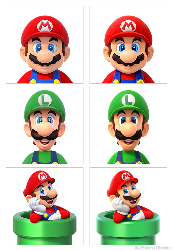
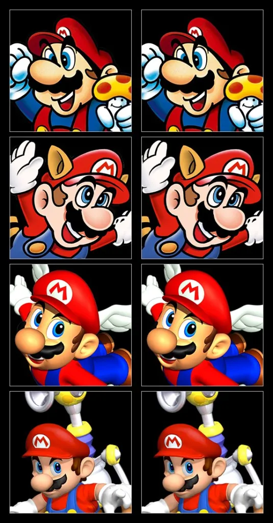
As noticed and relayed by dataminer Oatmeal Dome, the changes are to both modern and retro Mario icons, but unless you stare deeply at a side-by-side comparison, you are unlikely to notice much, and that is because most of the changes are just things like the removal of artifacts around the edges of the art, slight changes to positioning, or an enhanced coloring. Below, you can see the changes for yourself. Images on the right represent the new icons with the Nintendo Switch and Nintendo Switch 2 22.0.0 update. The images on the left represent the previous iteration.
Nintendo Fans Are Happy
Are these big and important changes? Not in the grand scheme of things, but Nintendo fans are happy with them, noting that while all the changes are subtle, that’s sometimes all it takes to improve an art asset.
“They’re better now,” writes one Nintendo fan of the changes. “The previous ones are slightly uncanny. Another Nintendo fan adds, “I noticed this when I was looking at icons a day or two ago. Mario looked noticeably better when posed in the pipe. Did not know it was actually changed!”
A third Nintendo fan drives the point home: “It really is the little things because the new ones are so much better.”