That may very well still be the case, as I don’t really want to assume that the Gen 10 Pokémon games will be masterpieces based solely on their first trailer. However, for what feels like the first time in a very long time, I have hope that they’ll be genuinely good. That is, largely, thanks to the series’ biggest upgrade showcased in the announcement trailer: the visuals. They’ve had quite the facelift since Scarlet and Violet, which impressed me almost immediately. However, I’ve been seeing reports that it doesn’t look as good as it should, that the Switch 2 still feels last-gen, something that, frankly, I have said numerous times in the past, too. Yet, I feel that this is all missing the point, as Pokémon Winds and Waves illustrates something we’ve always known about the franchise and Nintendo games as a whole: visuals don’t matter.
Pokémon Winds And Waves Prioritizes Style Over Fidelity
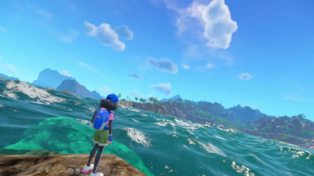
Image courtesy of Game Freak
It has felt, for quite some time, that Pokémon’s visual identity has been in flux, never quite assured of itself. The Gen 8 and 9 games very much borrowed from generic anime influences, opting for bright and vibrant visuals that look good from afar, but lack any real clarity, detail, or, most importantly, personality, up close. Pokémon’s region design and environmental variety dipped in quality significantly, especially in the shift to true 3D, with fields and forests beginning to lack the almost magical quality they’d been assigned during the older generations. Even iconic buildings like the Pokémon Centre changed designs in favor of more modernized variants that lacked both the style and nostalgic twist.
As a result, other than character designs, which remain excellent to this day, Pokémon’s aesthetic design felt distinctly un-Pokémon. This is one of the factors that has me hopeful about Winds and Waves, as the Gen 10 games have attempted to adopt a style that veers closer to the unique and creative choices made in games like New Pokémon Snap. It is refreshing to see, honestly, as, while it looks a lot cleaner than I’d probably like, there’s a bizarre quality to it inherent only to Pokémon, one derived from a mix of cultural and architectural influences clashing in the most beautiful of ways.
This is why I’m not particularly bothered that Pokémon Winds and Waves doesn’t look like a PlayStation 5 title. Sure, even free-to-play games like Genshin Impact and Seven Deadly Sins: Origins look leagues better. However, Nintendo has never been about chasing next-gen visuals, but rather cementing a unique style that never ages. Mario, Zelda, and, to an extent, Xenoblade have largely achieved this, as Mario titles from decades ago still look phenomenal today. Pokémon had, at one point, managed to accomplish this feat, but Scarlet and Violet especially pushed it well into the realm of feeling last-gen, rather than stylized. I’m glad that Winds and Waves has finally adopted a more timeless look that is sure to age far better than the nightmare fuel present in the Gen 9 Pokémon games.
Nintendo Games Don’t Need To Look Next-Gen, But They Do Need To Look Good
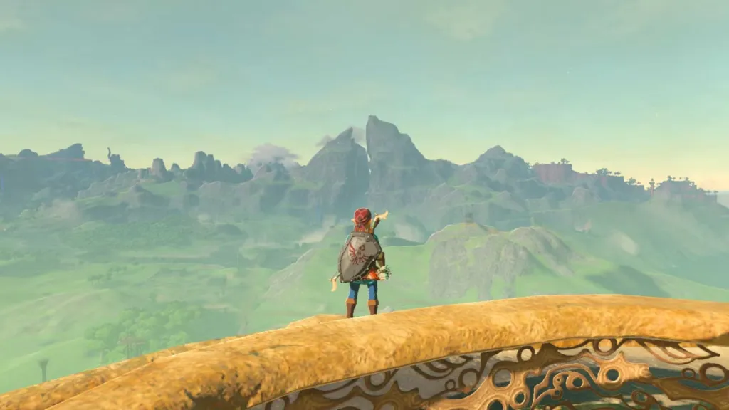
Image Courtesy of Nintendo
None of this, of course, is to say that Nintendo games can look bad. Rather, owing to its consoles’ relative lack of power, it makes logical sense for Nintendo to adopt clean and colorful aesthetics rather than photorealistic visuals. Nintendo’s visual brand is what allows so many of the best GameCube games, for example, to not simply hold up by today’s standards, but serve as masterclasses in style and creative direction. The Studio Ghibli-esque aesthetic utilized to such an effective degree in Breath of the Wild, the simple block colors and visual motifs of the Mario titles, the anime stylings of Xenoblade Chronicles and Fire Emblem, all serve to eschew any sense of uncanny valley or unfavorable comparisons to previous generations while still delivering visuals that are awe-inspiring and deceptively beautiful.
However, as great as BOTW looked, for the most part, the Nintendo Switch was far less focused on this goal than previous generations. Sure, the Wii catered to more gritty and realistic visuals through third-party developers, but Nintendo mostly kept a consistent style that mirrored much of what was achieved on the GameCube. The same can be said of its predecessors and direct successor. However, with the Switch, it felt as if Nintendo was eager to push for greater fidelity while still utilizing the same budgets it had in past generations. Fire Emblem: Three Houses, for example, struggled to deliver consistently beautiful visuals, something somewhat rectified by the far cleaner and simpler style of Engage. Pokémon, of course, is another good example of an attempt at a generational leap without the resources to achieve it.
Only Pokémon: Legends Arceus came close to achieving a timeless look with its watercolor-inspired visuals. However, even then, the barren fields and forests that comprise much of its region design ultimately got in its way of achieving said goal. All of this is to say that I hope, rather sincerely, that the Switch 2 stops attempting to push for greater fidelity where it is not needed, and instead opts for the cleaner look that Nintendo is so good at delivering. The granular details present in games like Red Dead Redemption 2 and Crimson Desert that help create such lifelike visuals are not a necessity in a Pokémon game. What is necessary are good quality textures that evoke the appearance of detail from afar and look smooth and clean up close. Pokémon Winds and Waves seems to have finally learned that lesson, at least from what we’ve seen thus far, and I’m hoping it sets a positive example for future Switch 2 first-party exclusives.
Do you think Pokémon needs next-gen visuals? Leave a comment below and join the conversation now in the ComicBook Forum!