Videos by ComicBook.com
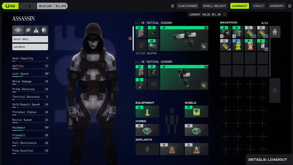
After spending time in the ongoing Server Slam for Marathon, it is clear that the core gameplay loop delivers tension and reward in equal measure, with gunfights that feel impactful and movement that carries weight. The problem lies in the interface, which struggles to keep pace with the action on multiple levels. In general, loot is difficult to read, icons do not communicate their function at a glance, and discovering what each item actually does requires hovering over it repeatedly, which slows the natural flow of play and forces players to adapt in ways that feel more like work than learning.
While you will eventually internalize the patterns after multiple matches, the initial friction is significant, and without serious refinement before launch, the UI risks undermining the game’s long-term potential, especially when compared to Arc Raiders, which presents information in a clean and intuitive way.
Loot Readability Is Marathon’s Biggest Immediate Problem
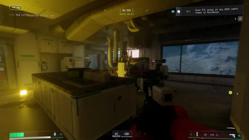
Loot readability as a problem becomes apparent the moment players start interacting with the environment, because items that are critical to progression do not consistently stand out from the background. Containers, dropped gear, and pickups blend into the scenery in numerous ways that make it difficult to determine what can actually be collected. That hesitation can throw off the pacing of a match, turning what should be a tense, strategic decision into a moment of awkward uncertainty that undercuts the game’s momentum.
As you play, you’ll gradually begin to recognize subtle visual cues after repeated runs, but that learning process feels like a penalty rather than a reward. In contrast, Arc Raiders presents loot in a way that is immediately understandable, allowing players to assess value and make decisions instinctively. Marathon, by comparison, forces constant second-guessing, which can diminish the intensity of encounters that are otherwise engaging and carefully balanced.