Videos by ComicBook.com
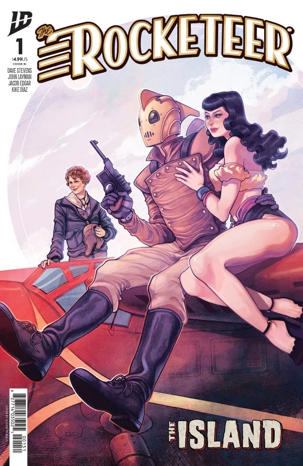
The Rocketeer: The Island #1 has a fantastic central premise, as The Rocketeer and a team of lovable icons set out to find the missing Amelia Earhart, who has been missing for a year. That creates a perfect opportunity for big action set pieces as well as love triangle hijinks, and while the first issue is mostly setup for the action mission, it’s thoroughly delightful, and I can’t wait to see what happens next.
Rating: 4 out of 5
| PROS | CONS |
| The vibe and tone of the original Rocketeer are intact | The ’30s dialogue goes a bit overboard at times |
| Edgar and Diaz are a perfect fit for the series | It takes a bit for the issue to truly get going |
| The supporting cast is a truly welcome surprise |
The Rocketeer Has Rarely Looked Better
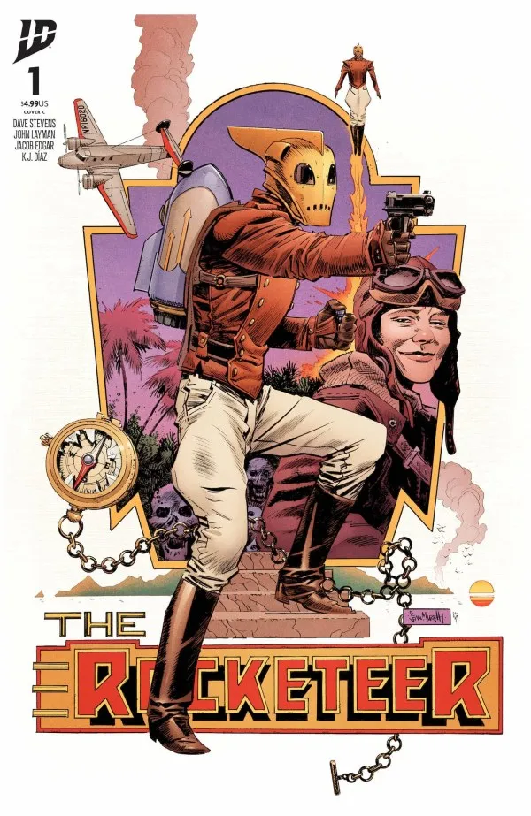
While it was previously mentioned briefly, the work of this incredibly talented team deserves far more praise. Edgar’s artwork is a brilliant fit for the series, with facial expressions saying everything loud and clear before a single word has to be said. This only gets better as the cast begins to grow through the issue, and while Popeye and Tintin were’t on my bingo card for this series, Edgar knocks these iconic characters out of the park.
Diaz’s colors are a perfect fit as well, giving the book a vintage quality that conveys the ’30s era while not losing the bigger color pops that keep your eye glued to the page. Warm greens, yellows, and reds stand out early, and those give way to more vibrant oranges, greens, and blues towards the book’s final few pages, and yet they all feel like they exist in the same world.